
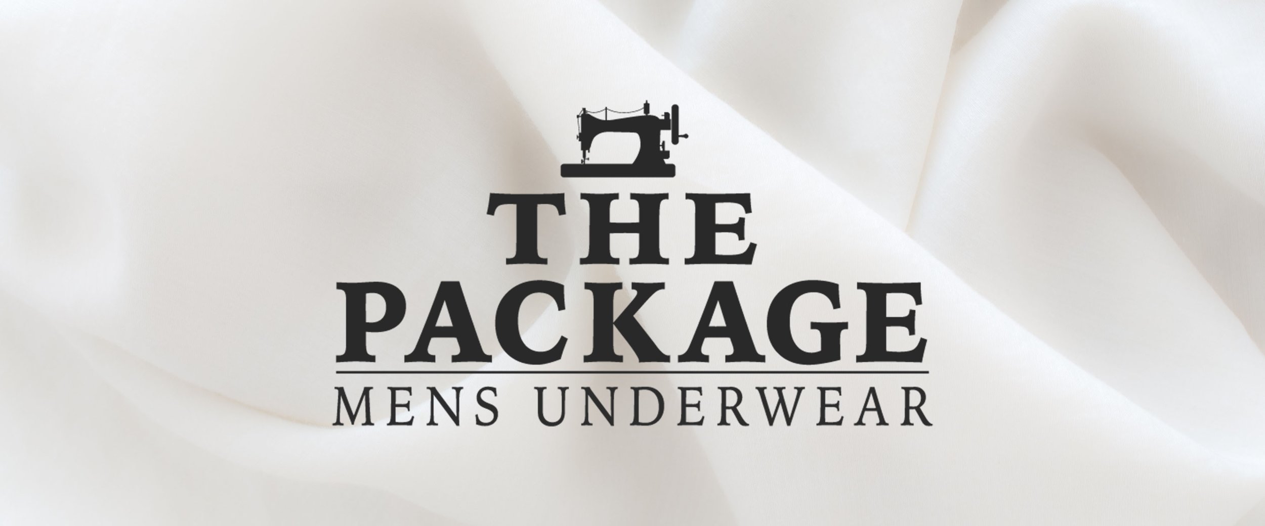
The Package
The Package is an upscale men’s underwear company. Photography and wordplay are key elements used to create a brand that feels sophisticated and humorous. The Package branding was created to allow consumers to consider the overall experience from beginning to end. This case study highlights the reasoning behind the decisions made when creating the brand.
Primary Logo
Icon

Secondary Logo
Submark
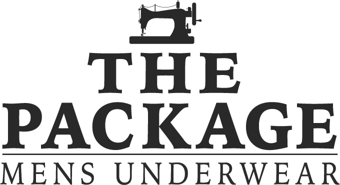
Logo: The Package icon resembles an old Singers 99K model sewing machine. Since 1851, the name Singer has been synonymous with sewing. Referencing the skill needed to operate these machines reflects the quality of our craftsmanship and the skill level of our tailors.
The Package logo is separated into multiple planes strategically stacked upon one another. The sophistication of the logo lies in its simplicity and mirrors the company’s image.
The icon, title and subtext of our logo are always shown together, separated by a thin horizontal line. They will always follow the proportions demonstrated on the adjacent page, in white or black. The icon may be used separately in the appropriate colors
The Package is a more than just a refined design. Use of wordplay and double entendre throughout our copy is intended to create hidden sexual innuendos to add humor and brand differentiation. This is also done in reference to the brand name. To maintain an upscale feel throughout the brand, these sexual innuendos are used sparingly and in very subtly ways.
The Package uses Iowan Old Style as its logo font because of its sophisticated serif qualities that convey a clean and refined feel. The Iowan Old Style family is used in various ways throughout our brand, while Iowan Old Style Black is used only within the logo.
Iowan Old Style Roman is used throughout the brand, beginning within our logo as well as the body copy. However, the treatment of the font differs depending on how it being used. All caps and wide kerning is used in the logo while the font remains unaltered in the body copy.
Finally, we use Century Schoolbook Italic Bold in our packaging as well as for headings throughout our brand.
The primary colors are seen throughout our brand are inspired by packaging materials, intended to create a stark contrast and even balance. Complementing these colors, our secondary colors were chosen to add a visual break from our primary colors.
The four primary colors are used throughout the major brand elements to provide a concise, cohesive look and mood.
Finally, our secondary colors are used for illustrations and design elements throughout The Package identity.
At The Package, we believe that the experience is a very important part of our brand. We continued this process by having unique interactive business cards. Our business cards are trimmed in a square shape to continue our square design, while the colors of the card continue the overall feel of our brand.
The sleeve of our business cards contain our logo on the front and our icon on the back. On the business card itself, the logo again appears while the information is provided on the back. This is important because it helps to continuously implement the mission of The Package.
The letterhead is very simple and follows the same layout as the brand book. It has an off white background on the front side with the iconic stitch across the top. The back of the letterhead has the tag line of the company in the upper right corner along with a photograph of the sewing machine and all the tools necessary to create the underwear.
The envelopes are made from the same material as the cardboard sleeve, and have the same square shape. This continues the same rhythm and further implements the style and rhythm created within the brand. On the back of the envelope, the flap has a loose stitch across the back that must be removed in order to be opened, resembling the removal of a belt.
Our photography emphasizes the quality of our product as well as our brand style. We highlight various stages of the underwear process by using close-up photographs as well as the tools used to create our product.
All photography shots of the sewing machine reflect the icon of our brand. Our photographs also show brightly colored photographs full of contrast, elevating and complimenting the brand as a whole.
Poster photography should extend off of the picture plane and must be presented with our logo and website URL placed in one of the corners. The posters are framed within the brand to give them an upscale feel.
The Package brand has unique colors that references the size of the underwear. The four colors associated with the size -- forest, dark grey, marine, and plum -- help the customers quickly find their size.
The packaging for our product comes in the form of a high-end cardboard box with a removable lid. The inside of the box has a photograph at the base, while the sides and inside of the lid references the size of the underwear. On the outside of the box is the logo and a colored band surrounding the packaging. The band states the size, style, and care instructions as well as our tagline, making everything concise.
Catalog:


Brandbook:


Catalog Covers:
2015 Branding Gallery Showcase at Melvin Art Gallery, Lakeland Fl.


