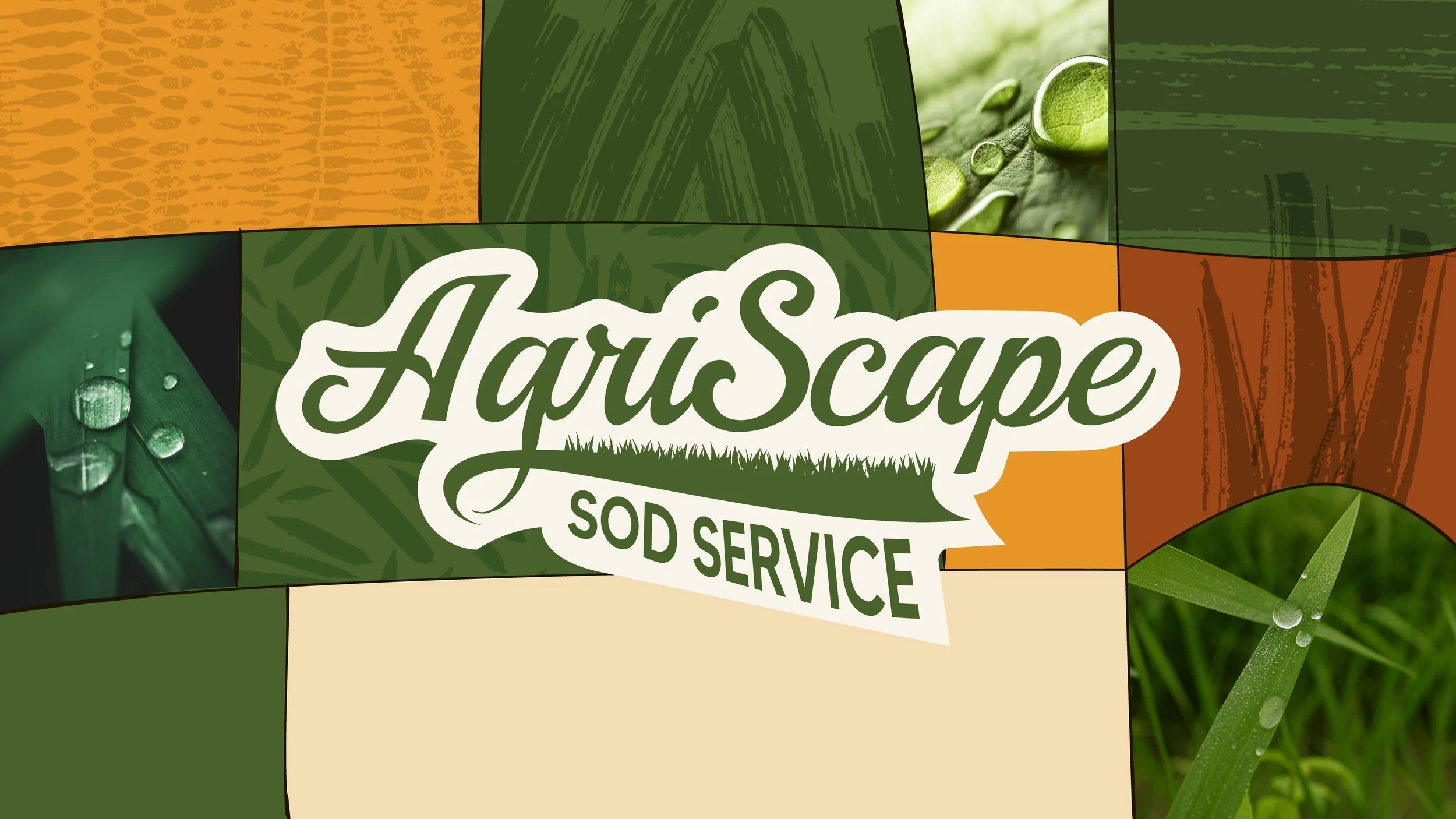
AgriScape Sod Service
Agriscape is a Florida-based sod service rooted in quality, craftsmanship, and community. The goal was to evolve an existing logo into a fully realized brand system that feels modern, trustworthy, and reflective of its agricultural roots. This project expanded beyond identity into web design and marketing materials, creating a cohesive experience across every touchpoint. This case study highlights the strategic decisions made to bring the brand to life.
Branding
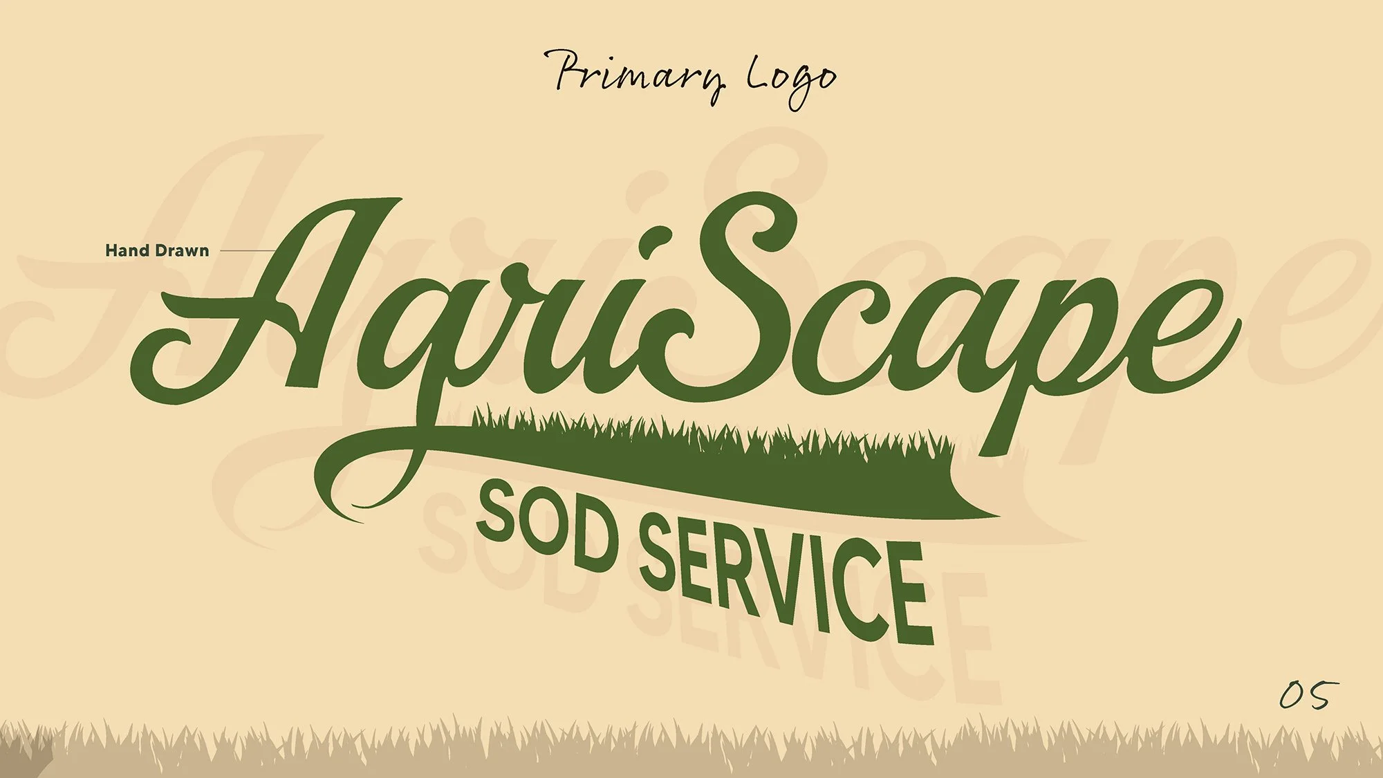
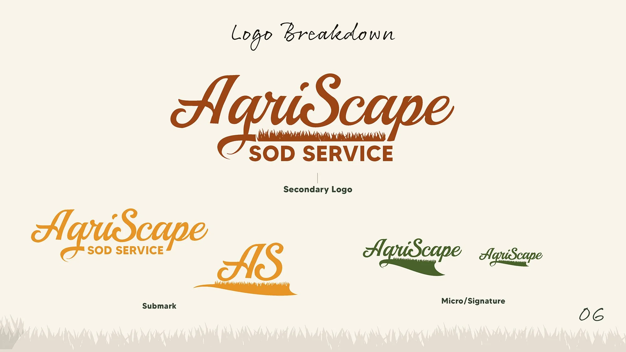
Primary Logo

Icon
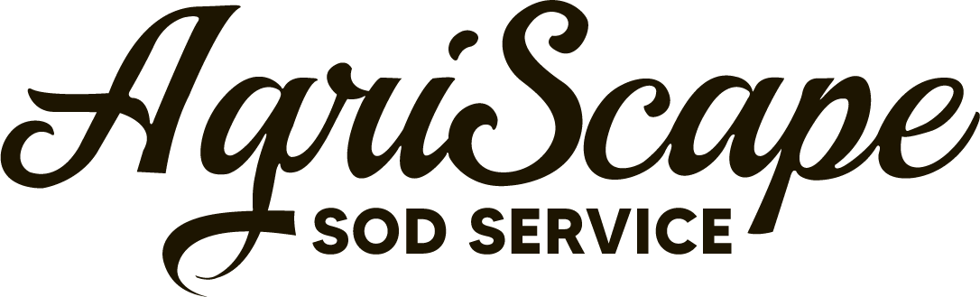
Wordmark
Secondary Logo

Submark
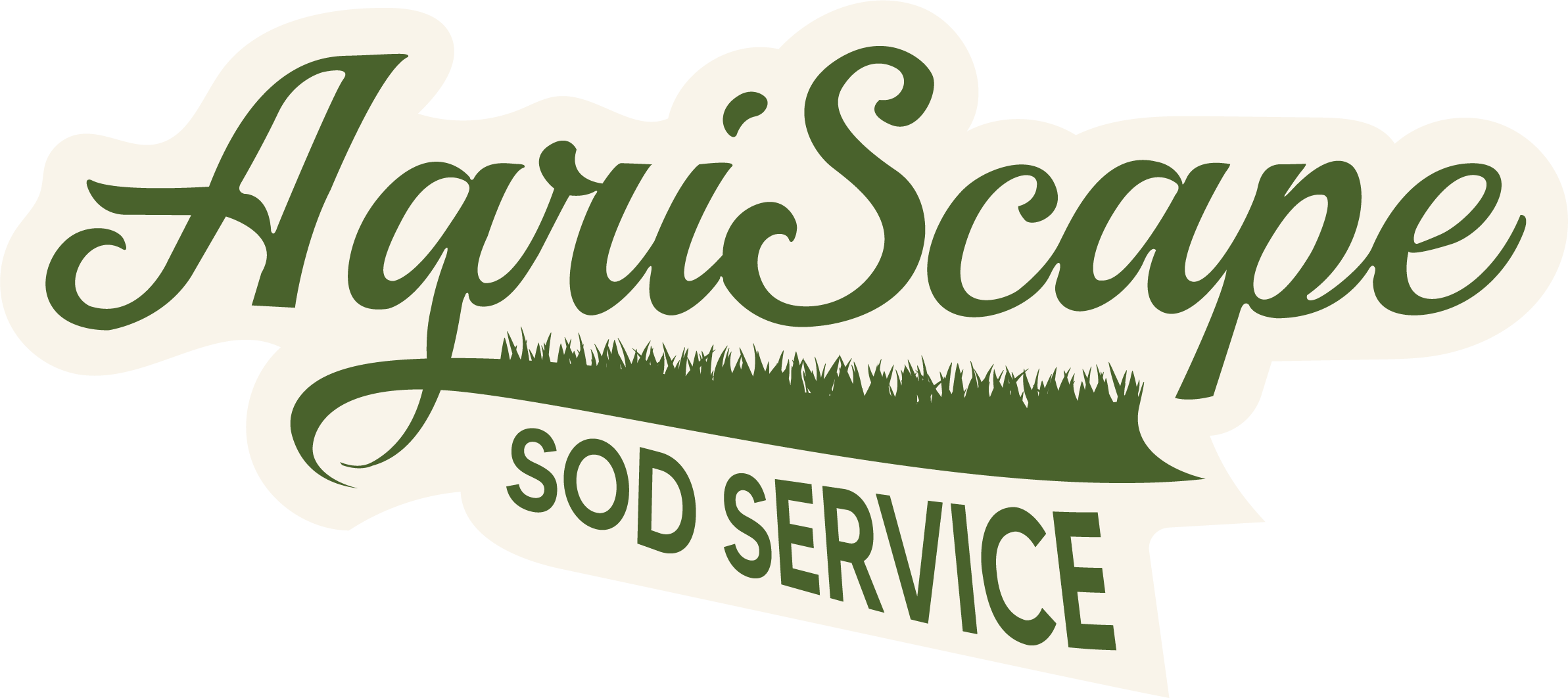
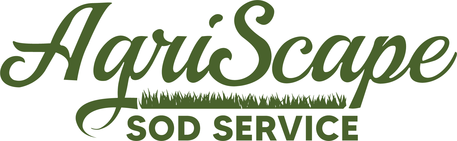
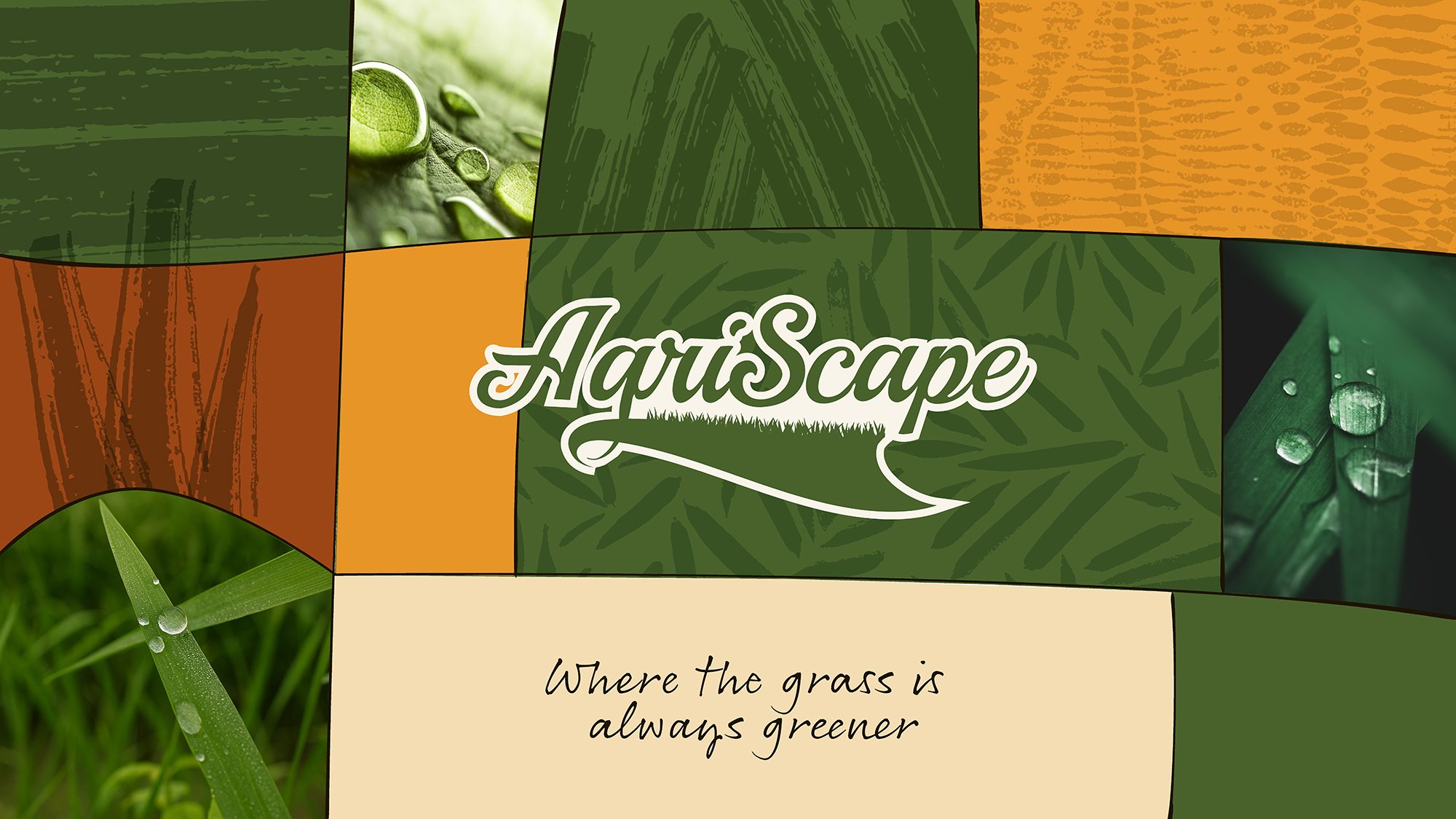
Logo: Agriscape began with an existing logo that had strong character but lacked versatility. The objective was to refine and modernize the mark while preserving what made it recognizable. Drawing from Florida’s agricultural roots, the updated logo introduces cleaner structure, improved balance, and a more intentional use of natural elements.
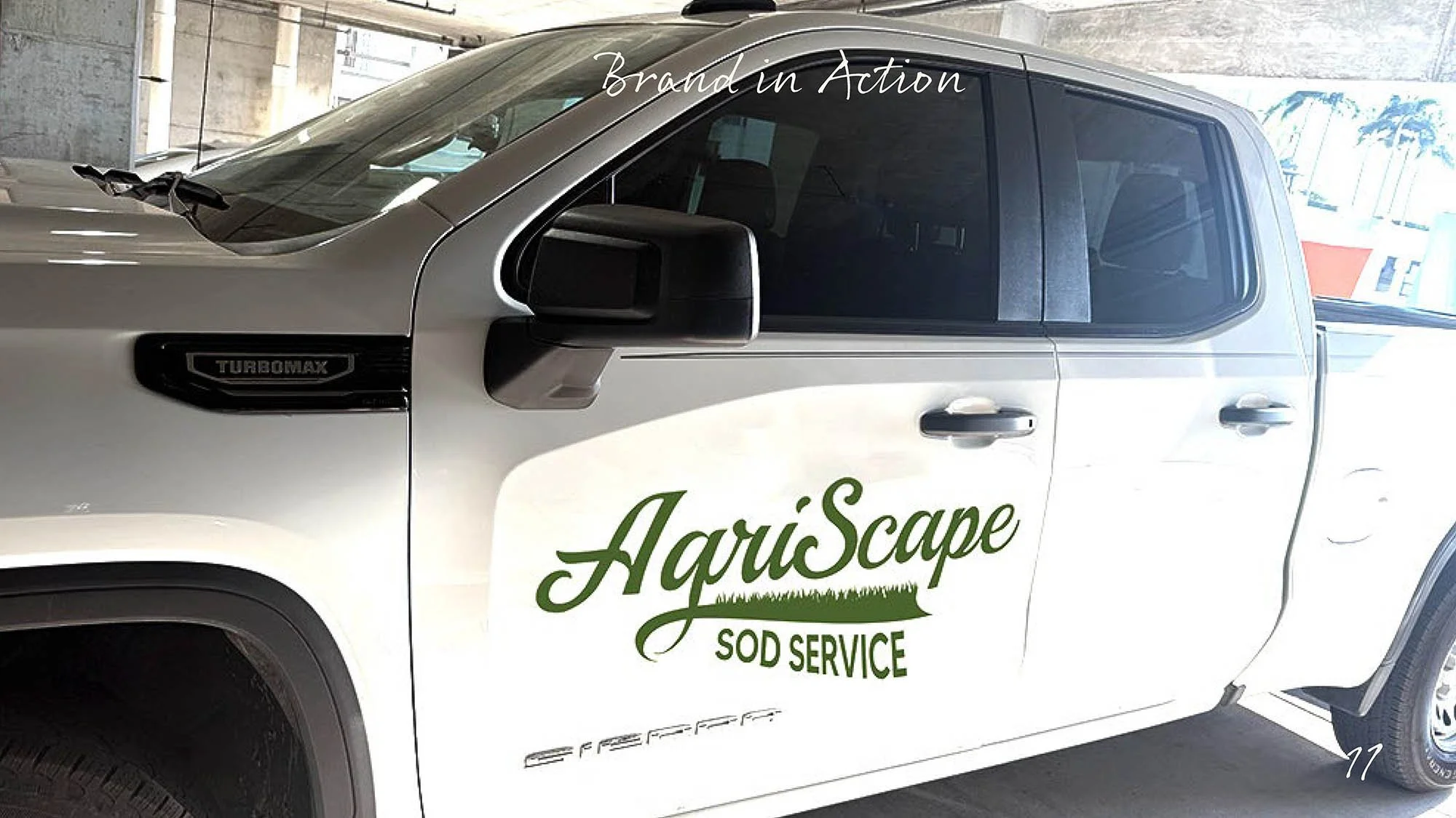
The result is a mark that feels both familiar and elevated: built to scale across uniforms, vehicles, and digital platforms.
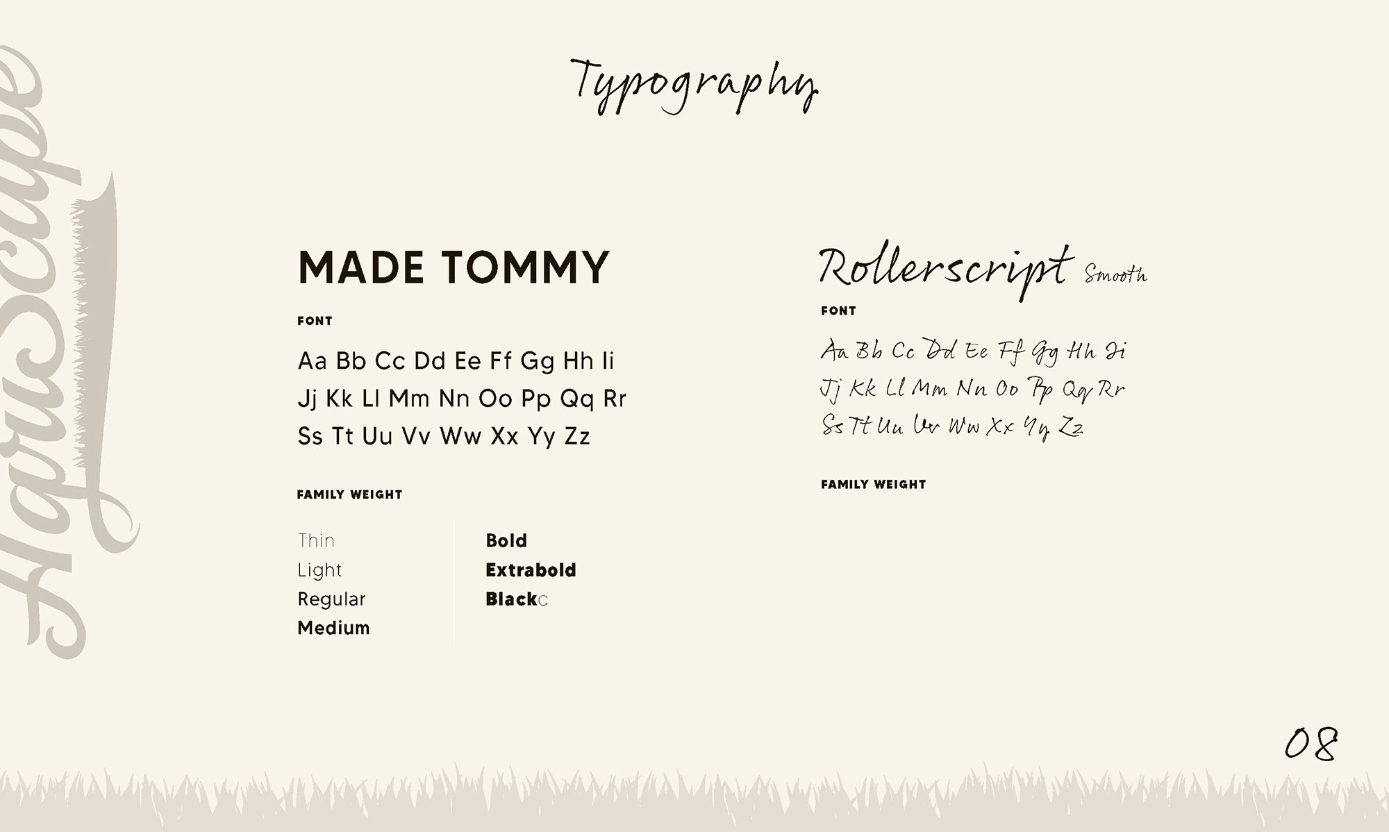
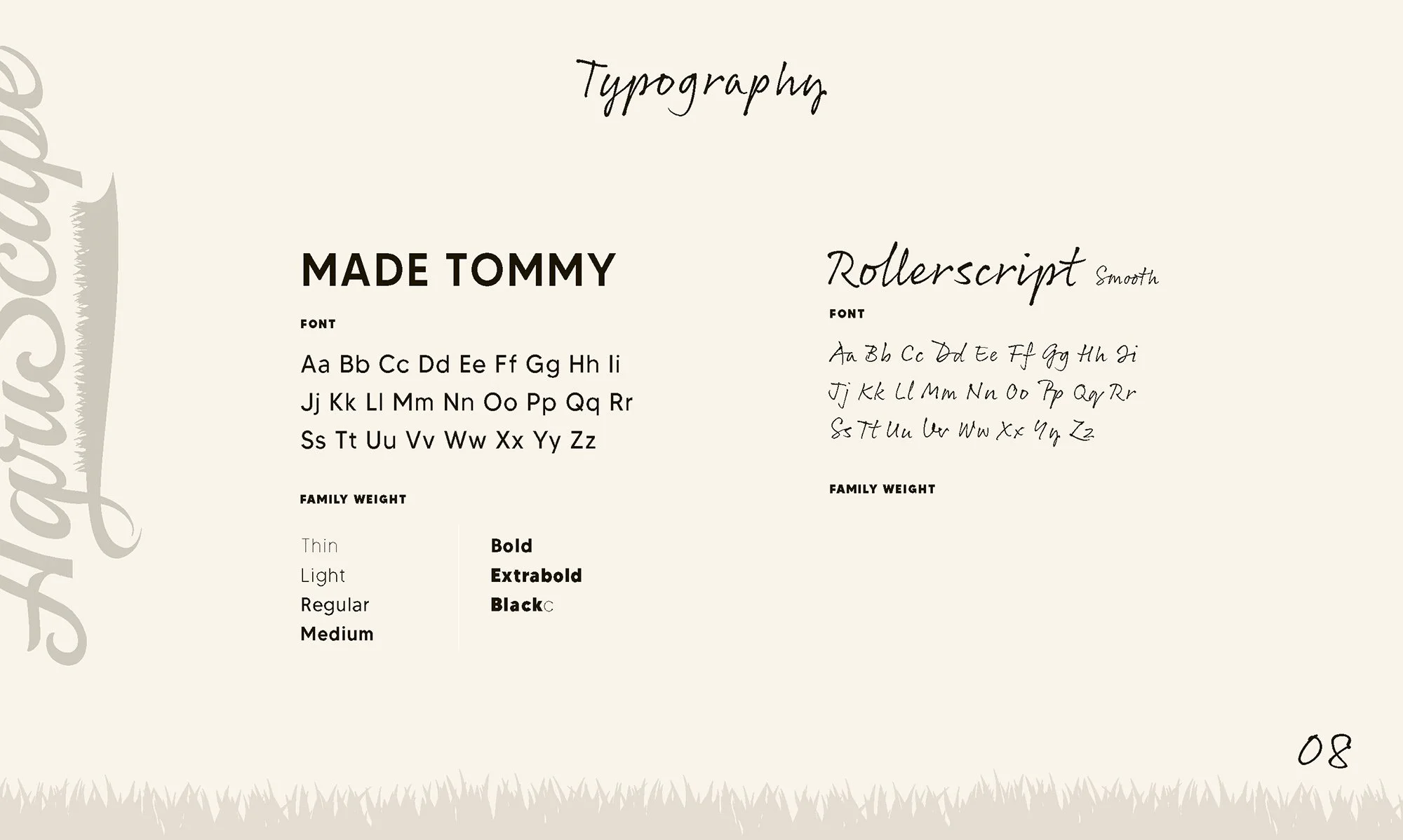
Typography pairs a clean, modern sans serif with a hand-drawn script to reflect both clarity and craftsmanship. The sans serif provides structure and readability across applications, while the script introduces a more personal, human touch—reinforcing the brand’s roots in hands-on work and tradition.
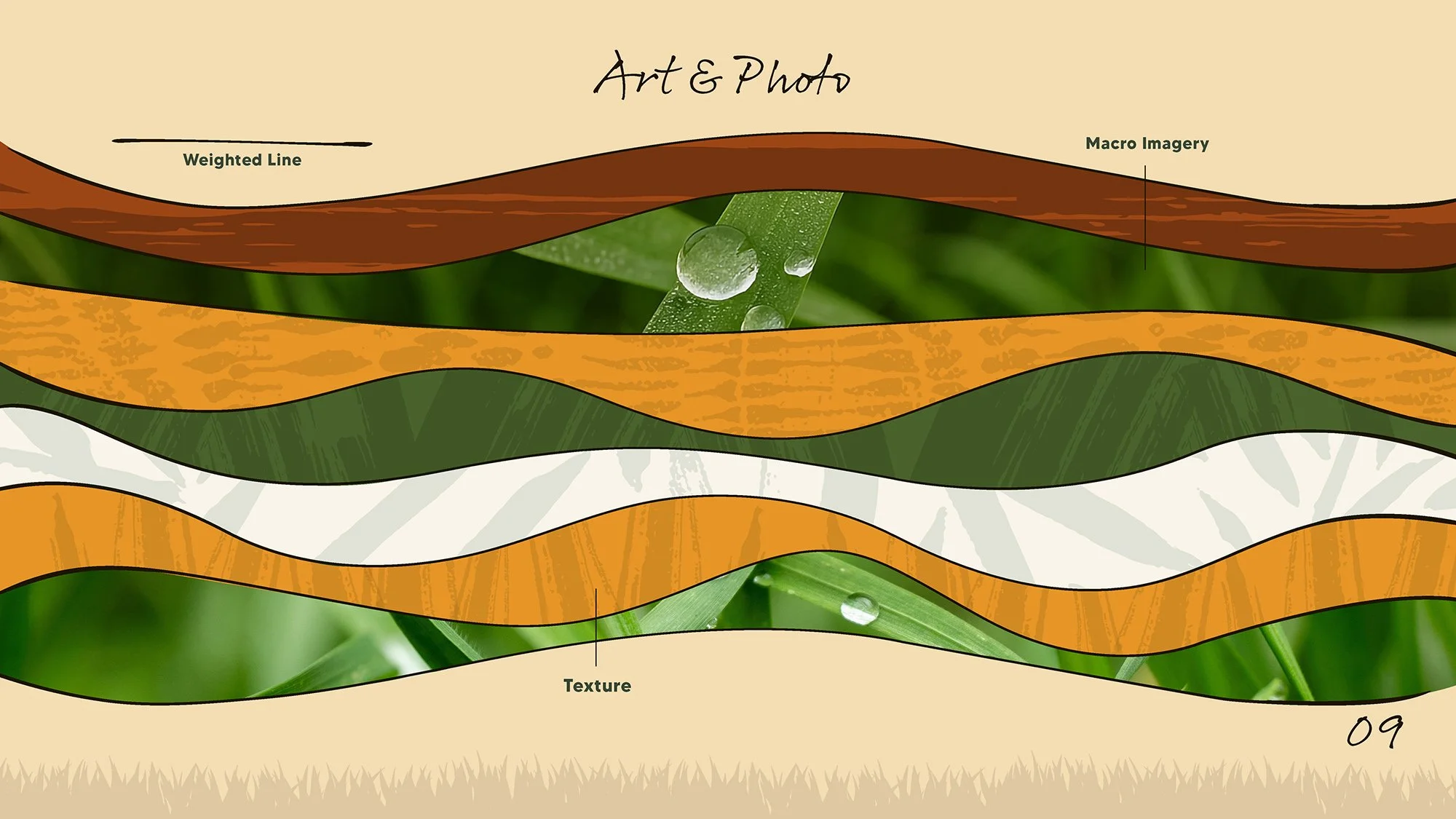
Macro photography and texture work together to highlight the natural quality of the product. Close-up imagery captures detail, moisture, and organic surfaces, while layered textures introduce depth and reflect the composition of the land itself. These elements create a visual language that feels grounded, tactile, and authentic.
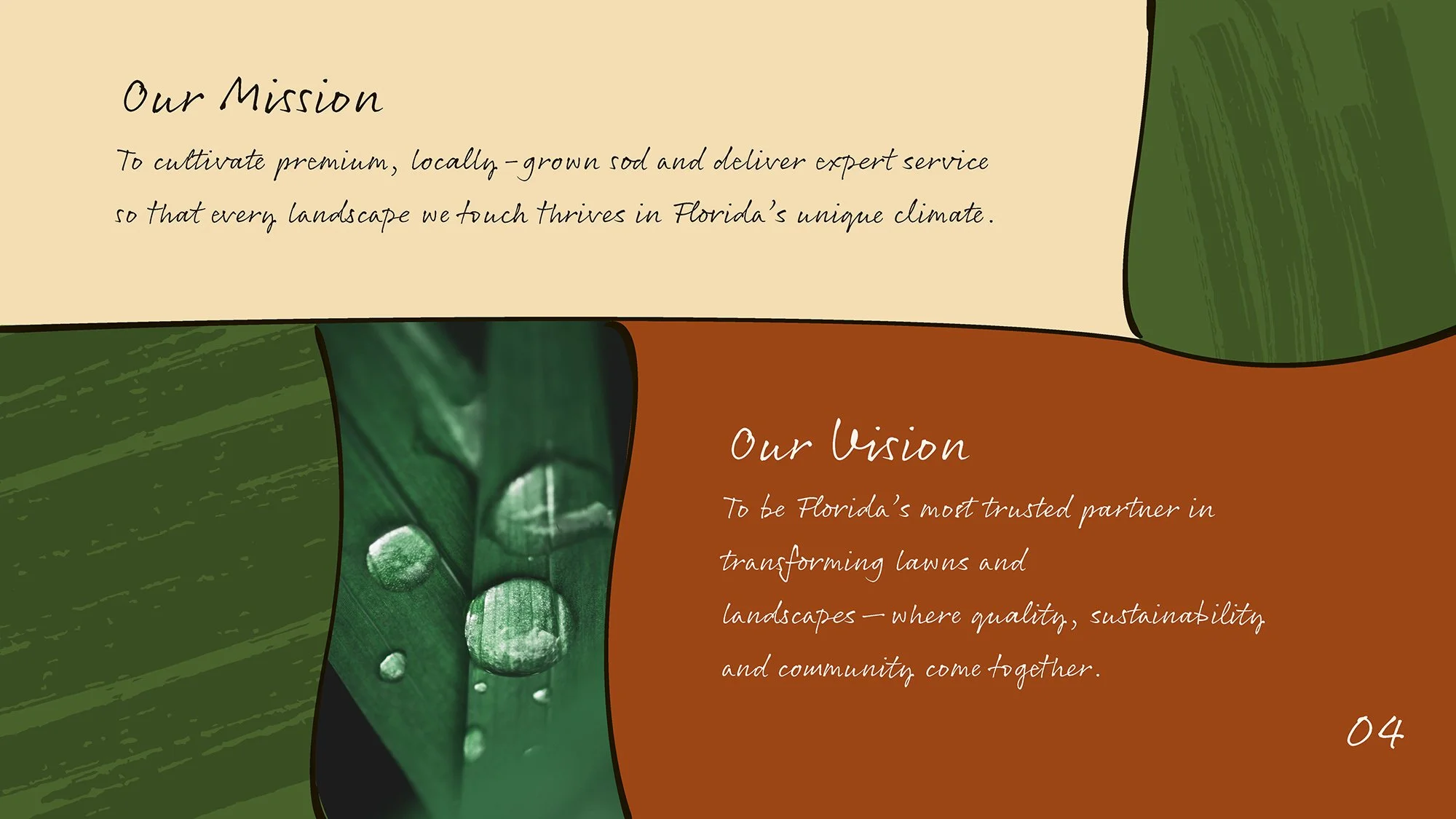
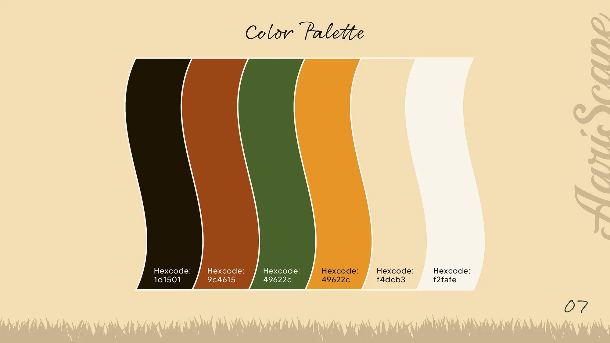
The color palette is derived directly from the environment, combining rich greens, warm earth tones, and soft neutrals to balance vibrancy with stability. Paired with intentional line weight, the system uses bold, organic forms to create structure and flow—mirroring the contours of the land while maintaining clarity and consistency across applications.
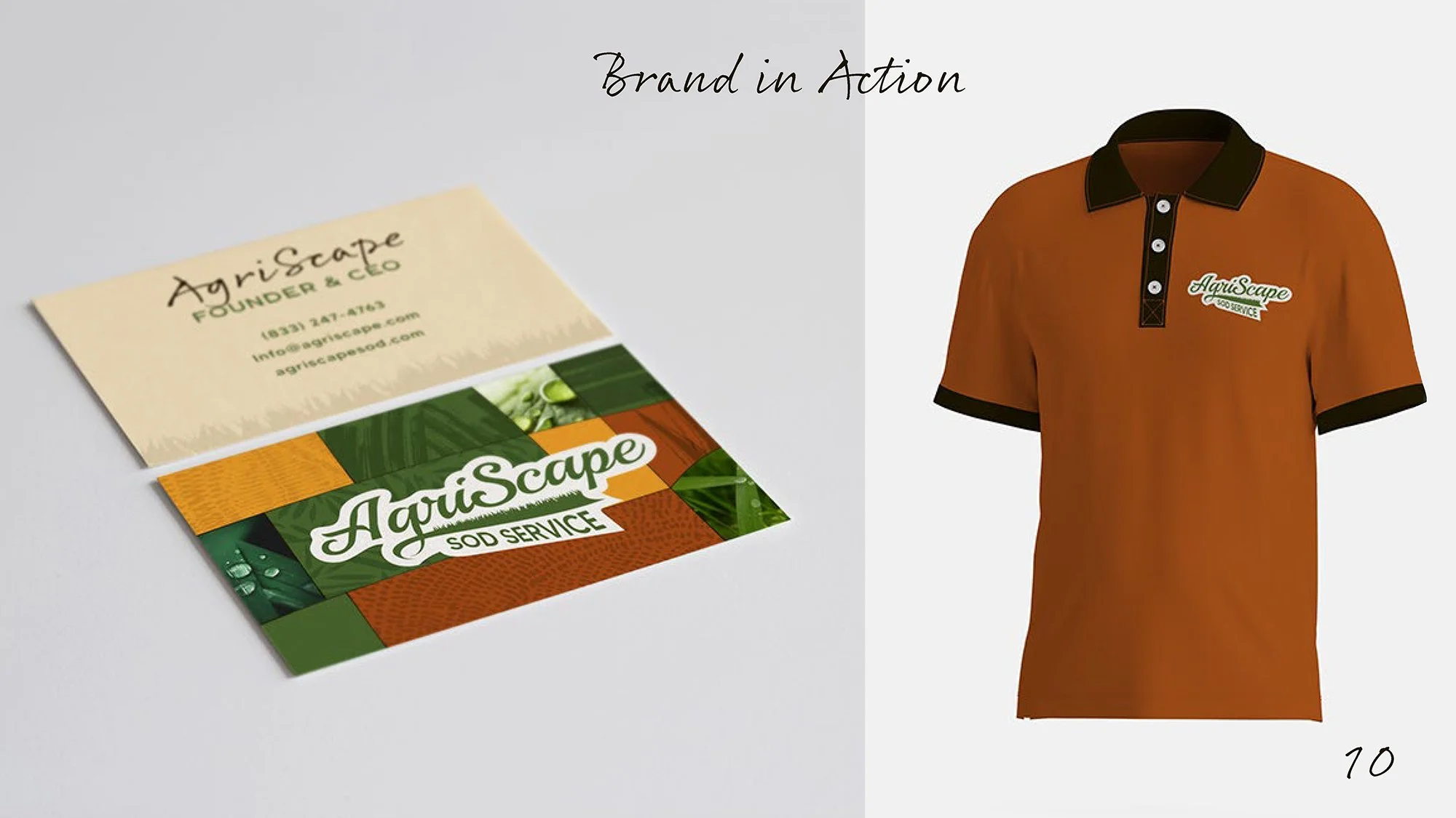
Brand Identity: The following gallery presents the complete Agriscape brand system, outlining the visual language and guidelines that ensure consistency across all applications.

Website Design
Old Website
The existing website contained a large volume of pages with limited structure, making it difficult for users to navigate and understand the business. The goal was to streamline the experience by simplifying the site architecture, clarifying key messaging, and introducing a cohesive visual identity.
The redesigned website focuses on clarity and usability, reducing complexity while guiding users through the brand, services, and offerings in a more intentional and accessible way.
The initial website redesign focused on simplifying structure and introducing a cohesive brand experience. Content was reorganized to improve navigation and clarity, while visual elements from the identity system were applied throughout—creating a more intuitive and unified digital presence.
The following video highlights the final, fully implemented website. Building on the initial design direction, the site was developed to deliver a streamlined, user-friendly experience while bringing the AgriScape Sod Service brand to life across every touchpoint.
View the live website here:
www.agriscapesod.com
Proposal booklet


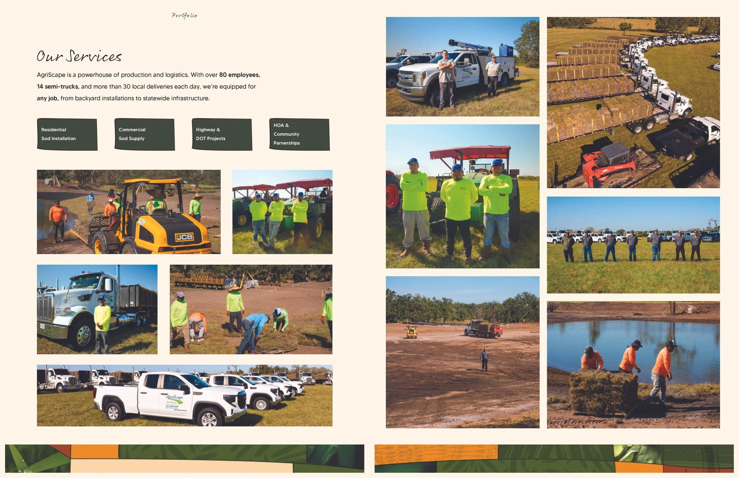


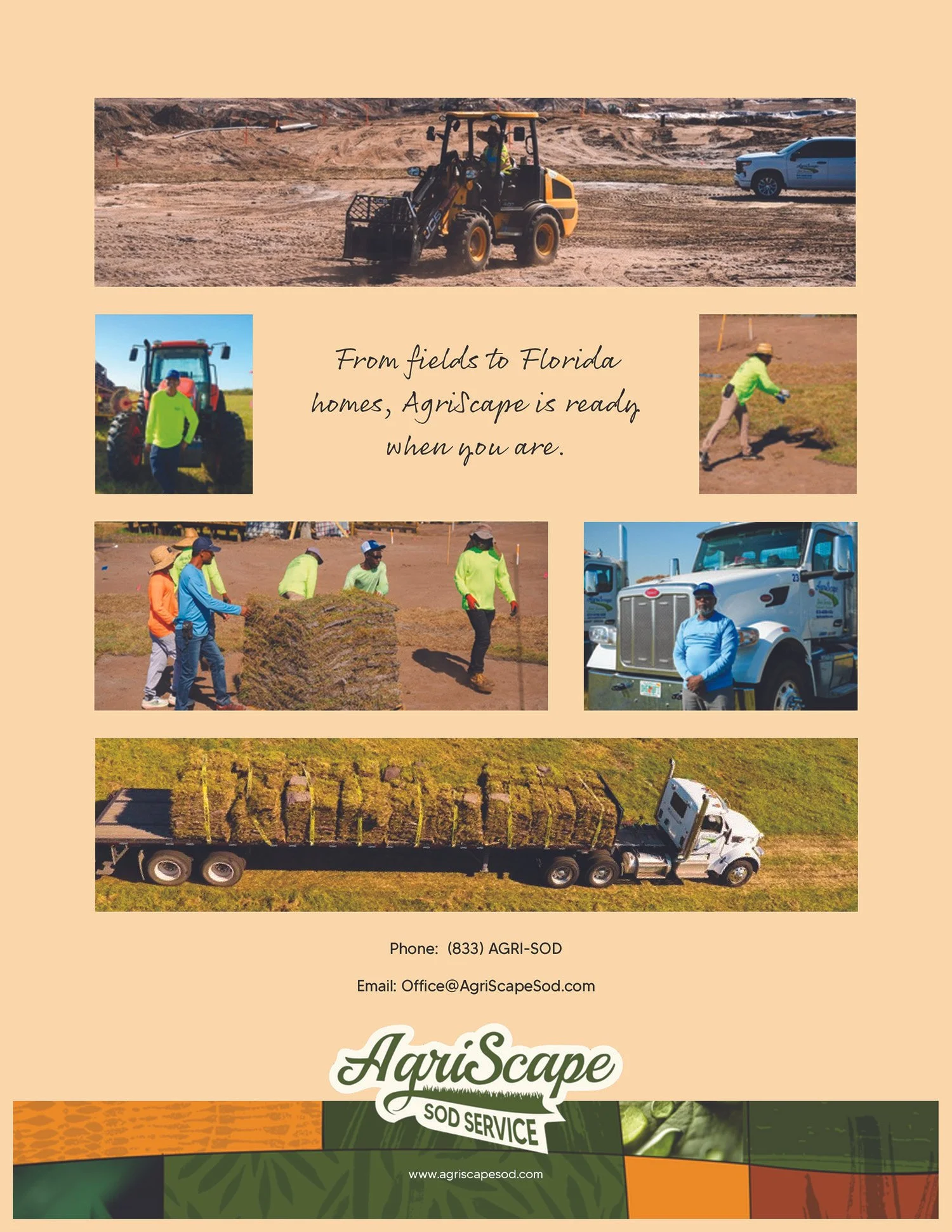
The printed proposal booklet extends the AgriScape brand into a tangible, client-facing experience. Designed to clearly communicate services, capabilities, and project scope, the booklet combines structured information with strong visuals to create a polished and professional presentation tool. Consistent use of typography, color, and imagery ensures the brand remains cohesive across both digital and physical touch points.